
Cards are a means of visually grouping content on a page. Cards can be completely custom, or build using any of the card options provided out-of-the-box. Cards may have a cover photo or preview image, a card body or multiple card sections with information about the content, and an optional footer.
Best Practices
Cards should:
- Be used to organize page content.
- Group related content. Otherwise consider using two separate Cards.
- Contain a maximum of one primary call-to-action per card.
- Position calls-to-action for next steps at the bottom of the card, and use the space in the top right for optional actions.
- Use Card Sections for related but distinct content. Multiple sections can help break up complicated concepts to make them easier to scan.
- Optionally use a heading to help identify the contents of the card at-a-glance.
- Cards with accents should be used sparingly.
Cards should not:
- Be nested inside each other.
Content
A standard Card has the following anatomy:
 |
The areas within a card can be populated either by providing the relevant props (title, subtitle, imageSrc etc), or by providing the following content components to your Card as direct descendants to the card:
- EzPreview (image or illustration)
- EzHeader (title and other header content e.g. card actions)
- EzContent (body)
- Footer.
Example
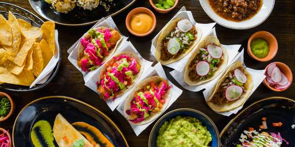
Amuleto Mexican Table
We pride ourselves on serving the most authentic Mexican food outside of Mexico. But we're warning you: once you try our food, you'll never be able to order from another Mexican restaurant. It's that good! Indulge in our variety of tacos or our flavorful house salsa. We can't wait for you to try it!
Basic Card
Cards use a background container to organize page content into meaningful groups.
Lorem ipsum dolor sit amet, consectetur adipiscing elit. Vivamus ultrices finibus purus, in maximus diam molestie nec. Aenean maximus eget lacus sed lobortis.
Lorem ipsum dolor sit amet, consectetur adipiscing elit. Vivamus ultrices finibus purus, in maximus diam molestie nec. Aenean maximus eget lacus sed lobortis.
Card with Heading
Cards can have an optional Heading for titles. Headings should be descriptive of the entire card, not just the first section within the card. Headings should be used when you want the content to be identifiable at a glance.
Heading sizes can be customized depending on the use case using by providing a Heading to your Card as children. The heading will be automatically placed within the cards layout according the card content guidelines.
Card Heading
Lorem ipsum dolor sit amet, consectetur adipiscing elit. Vivamus ultrices finibus purus, in maximus diam molestie nec. Aenean maximus eget lacus sed lobortis.
Card with Subheading
Cards can have an optional subheading to provide further information for the card. A subheading should only be used with a heading and should also describe the entire card, not just a particular section.
Card Heading
Lorem ipsum dolor sit amet, consectetur adipiscing elit. Vivamus ultrices finibus purus, in maximus diam molestie nec. Aenean maximus eget lacus sed lobortis.
Card with Heading Icon
Cards can have an optional heading icon.
Consider the appropriate the size, color, and accessibility of each heading icon.
Card Heading
Card with Footer
Cards can have an optional footer to provide a link to expand more contents of the card.
Expandable
Cards can sometimes contain a large amount of content when only a fraction of the content needs to be available at-a-glance. Expandable cards can be used to offer at-a-glance content, with the option to show more on demand.
Expandable cards should be used when space is a constraint and where the information is either not frequently used, or is not critical for the user to make informed choices.
When the expandable attribute is set a footer will appear at the bottom of EzCard for toggling EzCardExpandable components. To get the EzCardExpandable component to toggle, an isExpanded state must be passed down to both the EzCard and EzCardExpandable components. The expandLabel, collapseLabel and onClick properties are all required in the expandable attribute.
Card Heading
Lorem ipsum dolor sit amet, consectetur adipiscing elit.
Card with Actions
While call to actions are typically found at the bottom of a card, quick actions may optionally be included in the card Header. Optional actions should only be provided with a corresponding card title, such that the target of the action is clear. As the card header has limited space, it's recommended to minimize the number of actions offered.
Consider wrapping actions in an EzLayout to manage how they stack at smaller breakpoints.
Single Action
Card Heading
Lorem ipsum dolor sit amet, consectetur adipiscing elit. Vivamus ultrices finibus purus, in maximus diam molestie nec. Aenean maximus eget lacus sed lobortis.
Multiple Actions
Card Heading
Lorem ipsum dolor sit amet, consectetur adipiscing elit. Vivamus ultrices finibus purus, in maximus diam molestie nec. Aenean maximus eget lacus sed lobortis.
Card with Sections
Cards can have multiple sections to break up complex content into easier to digest parts. Card Sections are automatically separated visually with a divider when used in the default configuration (vertically stacked).
You don't need to use an EzCardSection if you only have one section in your panel (the component automatically wraps the content in a single section if needed).
- Card sections may optionally include a heading.
- Card sections may optionally include a subheading. A subheading should only be used alongside a card section heading.
- Card sections may optionally include actions. Actions should only be provided when the card section has a corresponding card title, such that the target of the action is clear.
Card Heading
Card Section Heading
Lorem ipsum dolor sit amet, consectetur adipiscing elit. Vivamus ultrices finibus purus, in maximus diam molestie nec. Aenean maximus eget lacus sed lobortis.
Lorem ipsum dolor sit amet, consectetur adipiscing elit. Vivamus ultrices finibus purus, in maximus diam molestie nec. Aenean maximus eget lacus sed lobortis.
Card with Horizontal Sections
Sections can also be laid out horizontally. There is no separator when sections are displayed horizontally.
Card Heading
Cards with Accents
Info Accent
Accented info cards can be used when you want to draw attention to a card that does not need immediate action.
Card Heading
Lorem ipsum dolor sit amet, consectetur adipiscing elit. Vivamus ultrices finibus purus, in maximus diam molestie nec. Aenean maximus eget lacus sed lobortis.
Card images
Card images can be used to enhance the content of the card and are ideal for marketing content. Images will render full-bleed inside of a card (i.e. without padding between the image and the card container). By default, images will fill the width of the container while maintaining their aspect ratio, however images positioned to the right or left of the container will fill half of the card, clipping the image to match the aspect ratio of the available space.
- use
imageSrcto provide an image URL - use
imagePositionto provide an optional image position;left,right,top, or responsive e.g.{base: 'top', medium: 'left'}. - use
imageMaxHeightto constrain the max image height. When using this option, if the image's aspect ratio does not match the aspect ratio of its box, the image will be clipped to fit the available space. This option is available forimagePosition="top"only. - use
imageMaxWidthto constrain the max image width. This option is available withimagePosition="left"andimagePosition="right".
Card with image at top
Lorem ipsum dolor sit amet, consectetur adipiscing elit. Vivamus ultrices finibus purus, in maximus diam molestie nec. Aenean maximus eget lacus sed lobortis.
Card with image on right
Lorem ipsum dolor sit amet, consectetur adipiscing elit. Vivamus ultrices finibus purus, in maximus diam molestie nec. Aenean maximus eget lacus sed lobortis.
Card Size
Cards apply spacing to the card container, card header, card sections and top-level content within the card body.
Medium is the default size for a card. Small cards are best for browsing content as part of a list or grid of cards.
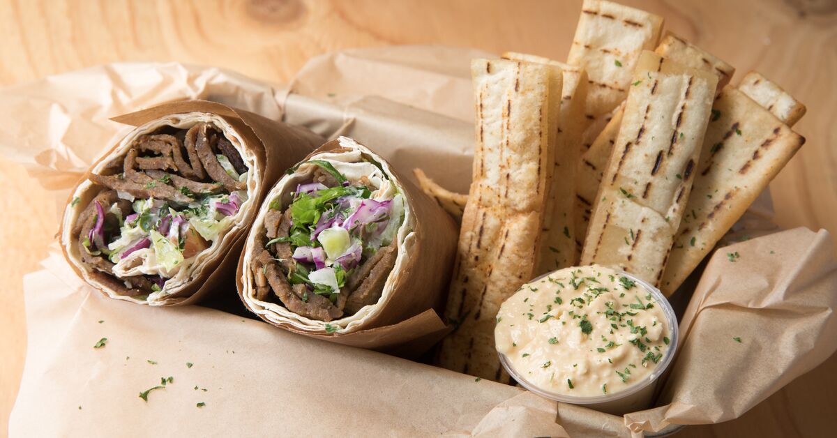
Splitz Wrap Boxed Lunch
4.7 (463 reviews)
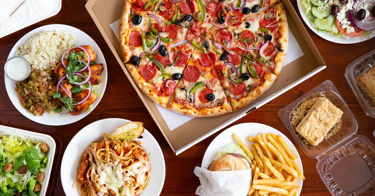
Flaming Pit Pizza
4.8 (671 reviews)
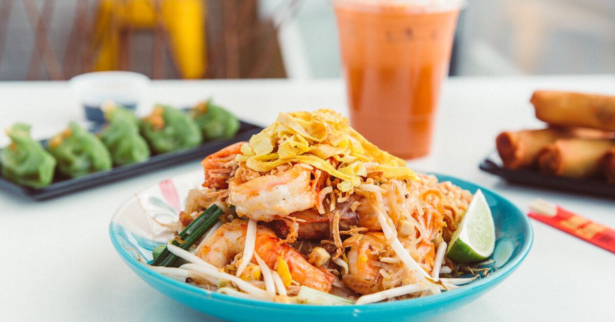
Dakzen Thai
4.7 (467 reviews)
Quiet Cards
By default, cards are intentionally prominent and use a drop-shadow to allow the surface of the card to appear slightly raised from the page. By contrast, quiet cards use a solid outline and appear flat on the page, as they are intended for secondary content or lists of homogeneous content where we intentionally trade prominence for easy-scanning.
Quiet cards are small by default.
Chicken Rice Bowl
Braised Beef Rice Bowl
$11.65Topped with your choices of up to 5 vegetables and 3 sauces. Consider adding drinks. Please limit your order to three bowl types.Cards with a Transparent Background
Use transparent flag to inherit the parent element's background color.
Lorem ipsum dolor sit amet, consectetur adipiscing elit. Vivamus ultrices finibus purus, in maximus diam molestie nec. Aenean maximus eget lacus sed lobortis.
Lorem ipsum dolor sit amet, consectetur adipiscing elit. Vivamus ultrices finibus purus, in maximus diam molestie nec. Aenean maximus eget lacus sed lobortis.
Clickable Cards
Clickable cards present a preview of a piece of content and offer a large hit-surface to make it easy to link to the full content.
A clickable card typically belongs to a list item - it is rare to see a clickable card presented on it's own. Using lists to present cards allows assistive technology to help users know how many cards are available and provide a shortcut between items.
When using clickable cards, the whole card surface becomes interactive and is visually presented as being clickable. Clickable cards should be reserved for content where there is a single unique and predictable outcome resulting from interaction with the card. Consequently, clickable cards should not contain more than one link, button or other call-to-action. For cards that require multiple links, buttons or other calls-to-action, consider using quiet cards instead.
- use the
clickableprop to indicate to users that a card is clickable - use the
onClickprop to handle click or touch interactions with the card. Typically this action will to trigger the navigation action of an link within the card, but may also be used to display a modal dialog.
Cards with a heading link
When the card heading text describes the content at the destination of the link, it follows that the header text should become the primary link for the card. The advantage here over having a specific calls-to-action within the card, such as "order now", is that each link represents a unique and descriptive label, which is useful when users are searching through aggregated lists of links.
In this example, the click handler for the card triggers the click method on the link found within the body of the card. This allows the whole card to act as a large hit-surface for the link, without negatively impacting keyboard users, who retain access to original link. Recipe takes care of perceived affordances, allowing users know that the whole card is clickable, not just the link inside the card.
Care should be taken to avoid triggering a redundant click event, caused when a click event directly on the link bubbles up to the card. The click handler for the card can be skipped if the user clicked the link directly.
Amuleto Mexican Table
4.7 (467 reviews)
Card with a specific call to action
Depending on the content of the card, and the context of the current page, it may prove instructive to provide an explicit call-to-action (CTA) button or link within a card to grab the user's attention or further emphasize that a card is interactive.
Calls-to-action tell the user exactly what action to take and how to take it, and are often short simple instructions like "Order now" or "Read more".
Calls to action may need some extra help to ensure the user has sufficient context to know what the link represents. In particular, when multiple CTA links are aggregated into a glossary for assistive technology, it becomes difficult to determine what the link represents. To avoid this issue, it typically makes sense to use the logical title or heading as the primary link, and use the CTA as an additional decorative element.
Use aria-hidden=true on the CTA to remove the redundant functionality and avoid the unwanted tab-stop for keyboard users. We can re-attach the CTA "order now" text to the heading link as a description using aria-describedby. This can help to avoid confusion for sighted screen reader users, allowing the link to be read as "Taco bar for Taco Tuesday, Order now".
Taco bar for Taco Tuesday
Or taco any day. Spice up your next meeting.
Limitations
- Cards currently do not support varying horizontal/vertical layouts for Card Sections across breakpoints.