Carousel
Carousels allow users to browse through a set of items to find items that may be of interest to them.
Best Practices
Carousels should:
- Highlight a small number of items from an otherwise large set (no more than 16 items).
- Be used when there is not enough space to show the complete set of items.
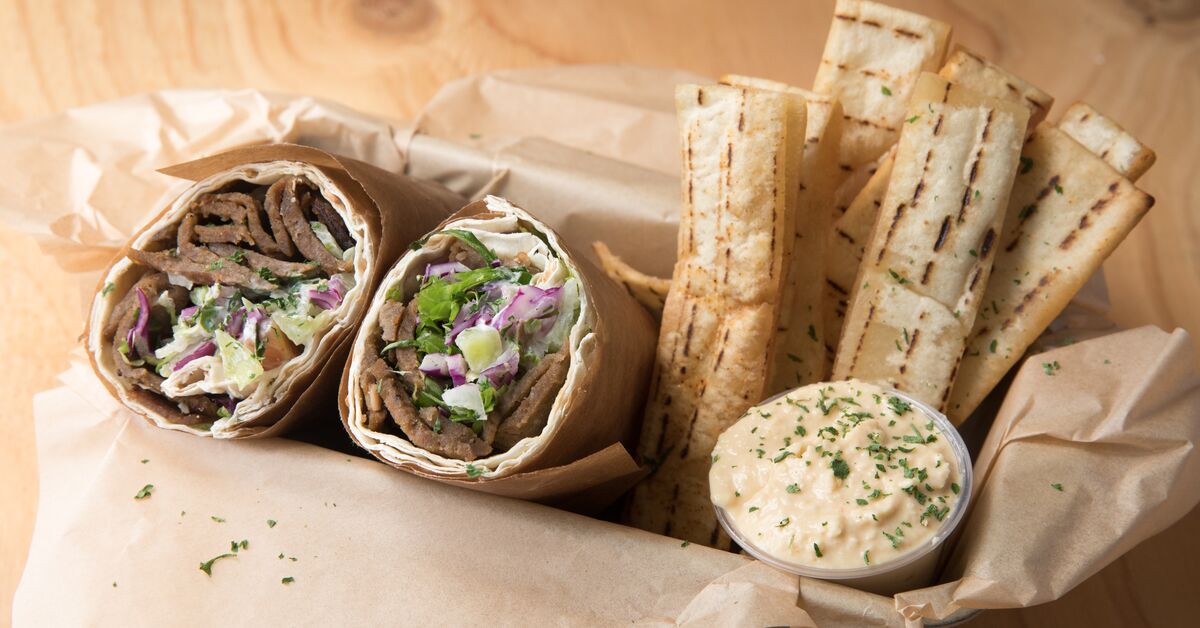
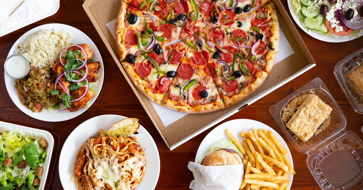
- Contain highly visual content, typically caterer or menu images.
- Be used with an EzCard for each item.
Examples
Basic Carousel
A carousel with required props title and description. The description is used for the aria-description of the carousel.
The carousel will automatically determine how many slides to show per page as follows:
-
Desktop viewports (
>= 768px) will show a number of cards per page depending on the container width:- container width
> 1024pxwill show 4 cards per page - container width
650pxto1023pxwill show 3 cards per page - container width
< 650pxwill show 2 cards per page
- container width
- Mobile viewports (
< 768px) regardless of container width will show all cards with horizontal scroll
To view the behavior on a wider page, see the responsive example in the Cookbook.
Basic carousel
Link
A carousel with an optional navigational link. You must provide link an EzLink.
Carousel with link
Page Change Handler
Providing an optional function to onPageChange will call that action when the user clicks a page change button in the carousel for desktop viewports, providing a method of tracking user interaction. If needed, the previous and current page numbers are available as arguments, starting at page 1.
Carousel with page change handler
Practical Example
An example of how you might use the carousel in conjunction with other components to build a compelling experience for browsing products.
To view the behavior on a wider page, see the responsive example.
Practical example

Splitz Wrap Boxed Lunch
